

Color Science for Band Logos
Why is Nirvana's logo yellow but The Rolling Stones red and does it really matter? According to a recent article by Leo Widrich at Buffer the color of a bands logo could affect its ticket and album sales.
Color Science for Band Logos
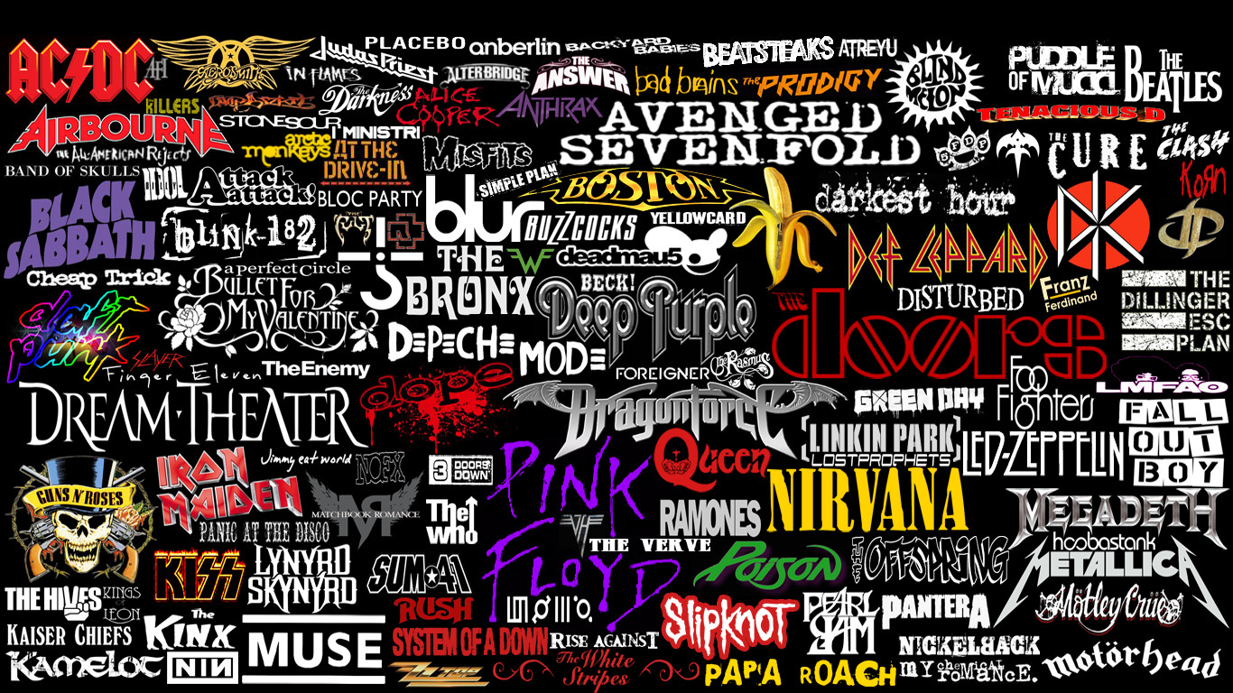
First here are some classic band logos. Based on the colors can you get a sense of their music?
Which colors trigger which feeling?
The nice folks at The Logo Company have come up with which colors are best for different bands and artists.
BLACK - powerful, strength, definite, credible, direct
GREEN - natural, organic, youth, adventurous, calming
BLUE - credible, clean, focused, professional
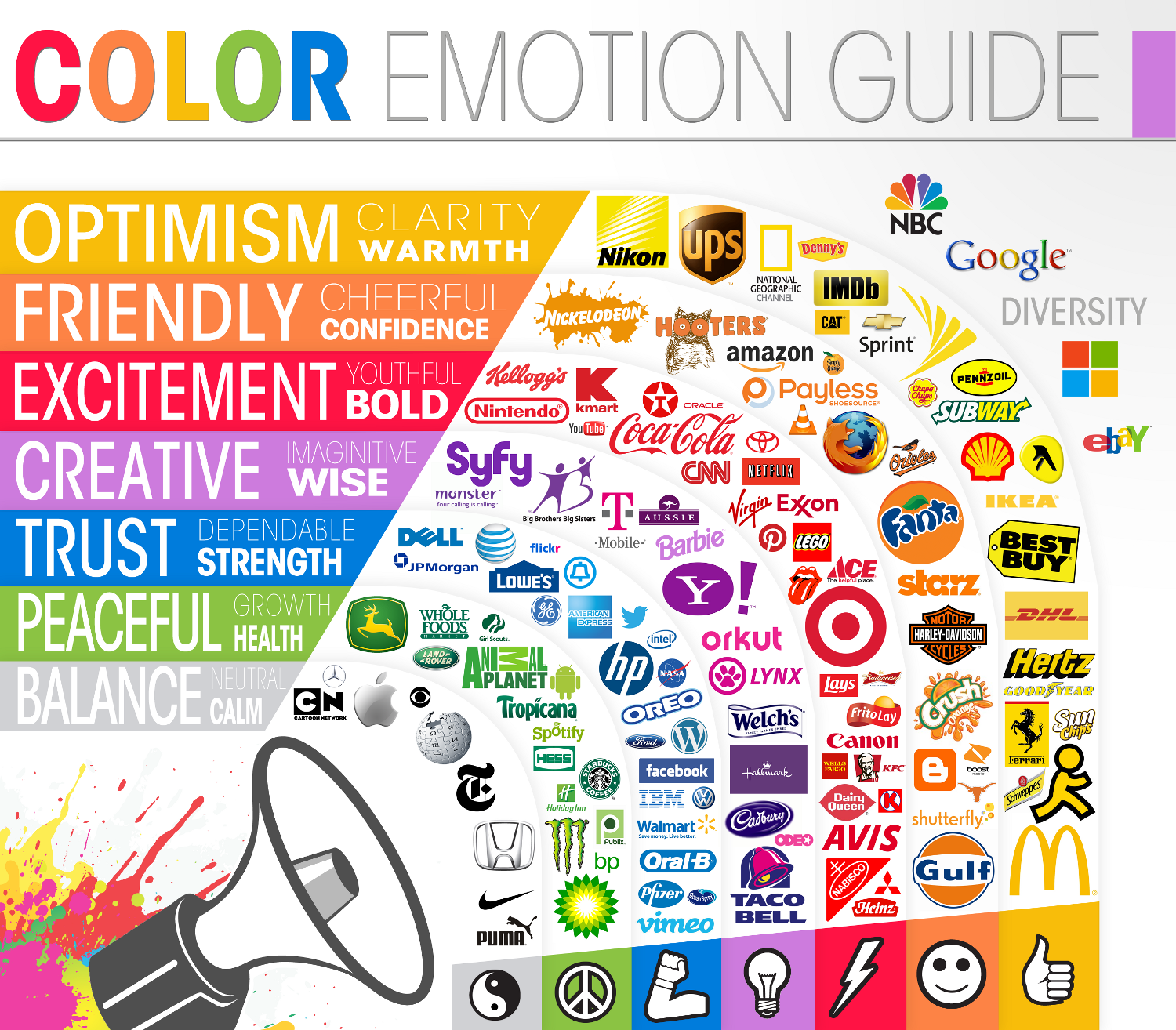
When you look at major non-music brands you see their use of color to create emotions.
Science of Color for Band Logo Design
Color Science for Band Logos
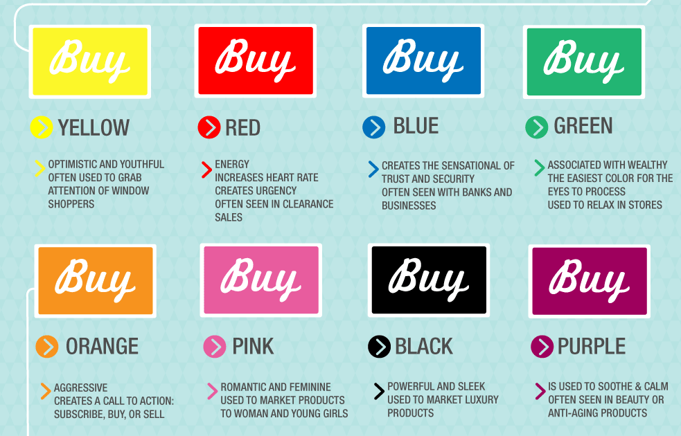
Analytics company KISSMetrics recently created a very cool infographic on the science of how colors affect purchasing decisions.
Red and black/white are used frequently by bands and music artists looking to project power, strength, excitement and youth. Although it's interesting to see that some bands flip the idea of color psychology on its head. For example a grunge band like Nirvana using yellow, a color usually intended to denote optimism or Pink Floyd's purple lettering, a color seen as calming, feminine and more often used on anti-aging products.
How to Choose a Color for your Band Logo
If you are an artist or band whose fans are mainly women, here is KISSmetrics advice for you:
- Women love: Blue, Purple and Green
- Women hate: Orange, Brown and Gray
However if your music has a mostly male following things are different:
- Men love: Blue, Green and Black
- Men hate: Brown, Orange and Purple
So did you think about color when choosing your logo? Would love to hear your ideas.
Color Science for Band Logos